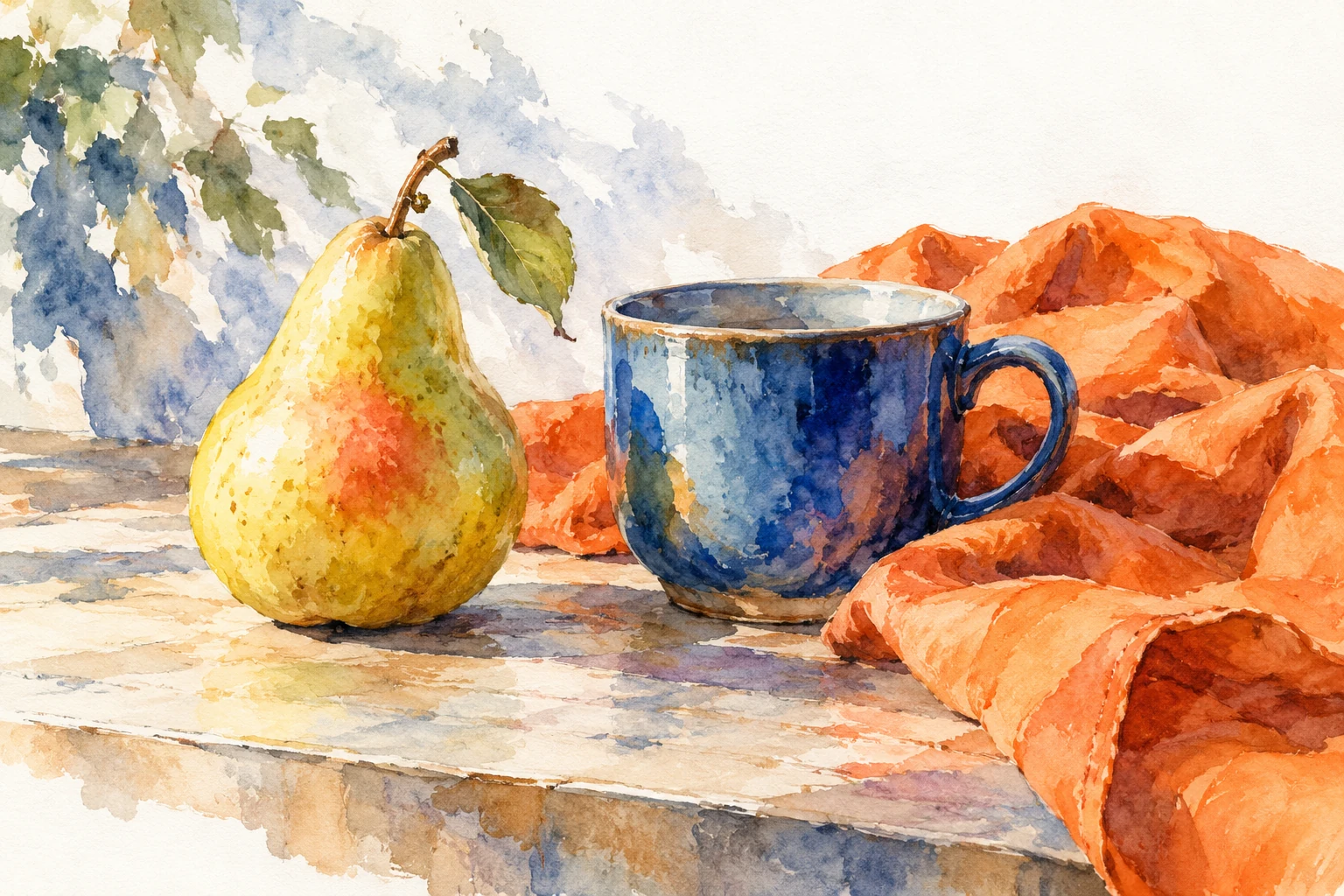
Color theory for beginners: make colors work together
Learn to separate hue, lightness, and intensity, then turn a small set of colors into a readable composition with a clear focal point.
Find the relationships that make an image work.
18 practical guides
Learn to separate hue, lightness, and intensity, then turn a small set of colors into a readable composition with a clear focal point.
Build a palette from a concrete brief, assign colors to real design roles, and evaluate alternatives without collecting endless unrelated swatches.
Use opposing hues with controlled area and lightness, then troubleshoot vibrating edges and competing accents in a practical two-color composition.
Create a coherent palette from neighboring hues while preserving depth, legibility, and a useful focal point through lightness, intensity, and spacing.
Understand color temperature as a relationship, compare warm and cool versions of a hue, and use those shifts deliberately in illustrations and layouts.
Build lighter, darker, and quieter versions of a base color, then choose a short range that stays distinguishable in real illustrations and design components.
Read a color wheel as a map of hue relationships, then translate its schemes into practical choices about area, lightness, and emphasis.
Create visual variety within a single hue family by organizing lightness, intensity, edge treatment, and material texture around a clear focal area.
Reduce a project to a few useful colors, decide what each must communicate, and preserve variety through proportion, pattern, and smart image treatment.
Diagnose weak or noisy color relationships by checking hue, lightness, intensity, area, and edge contrast independently, with a practical still-life exercise.
Use the shapes around and between objects to improve placement, proportions, grouping, and breathing room in drawings, posters, and small compositions.
Use a thirds grid to explore placement, horizons, and directional space, then judge the actual shapes instead of forcing every subject onto an intersection.
Compare symmetry and asymmetry, judge the apparent weight of shapes, and balance a composition without making every side mechanically identical.
Direct attention with a coordinated choice of contrast, scale, placement, and detail, then reduce competing signals without flattening the rest of the image.
Use repeated shapes, varied intervals, and intentional breaks to create movement and structure in illustrations, posters, and decorative compositions at different scales.
Compare frames that change a picture’s subject, remove edge distractions, and preserve useful directional space without relying on a single formula.
Use tiny, fast drawings to compare framing, light-dark masses, and focal placement, then choose a direction with evidence instead of polishing the first idea.
Explore how color relationships support an intended atmosphere while accounting for context, imagery, materials, and the expectations of the people who will see the work.