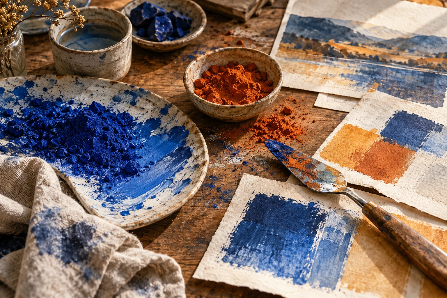
Complementary colors: build contrast without visual noise
Use opposing hues with controlled area and lightness, then troubleshoot vibrating edges and competing accents in a practical two-color composition.

Treat opposition as a starting point
Complementary colors occupy opposing positions on a chosen color wheel. The exact pair depends on the model: a painter's wheel and a digital color model do not organize every hue identically. For design work, the important question is what the pair does in your actual composition, under the intended viewing conditions.
Pick one specific pair and compare several lightness and intensity versions. Blue with muted orange may feel quite different from brilliant cyan with brilliant orange. The relationship supplies a strong difference in hue; you still need to decide which color carries the subject, which supports it, and how much of each appears.
Break the equality
Give one hue the larger field and reserve the other for a focused area. A broad quiet blue surface can support a small orange object. Repeating the orange at every corner dilutes that focus, because the accent becomes a competing system rather than a single destination.
Unequal intensity is another useful control. Keep the accent clear and soften its counterpart toward a neutral. This does not mean muddying everything. It means preserving a deliberate range: a forceful note can remain forceful because the neighboring areas are calm enough for it to stand out.
Repair uncomfortable boundaries
When intense opposing colors touch at a sharp edge, the boundary may feel restless or difficult to follow. Separate them with a narrow neutral gap, reduce the intensity of one side, or change their lightness difference. Test each adjustment on the final size rather than only on an enlarged canvas.
Avoid placing small essential lettering directly across a visually active pair merely because the colors look dramatic. Move the words into a quieter field. Hue contrast and readable detail solve different problems. A successful poster can keep its energetic central image while giving its date and venue a comparatively stable home.
Use repetition with a reason
A secondary appearance of the accent can connect distant information, but decide what that connection means. If orange marks both the subject and the event date, they become a useful pair. If it also marks decorative dots, borders, and every caption, it loses that clear assignment.
Look at the composition from across the room. Can you name the main shape before reading? Then inspect it close up for edge quality and small details. These two viewing distances expose different problems: overall competition at a distance, uncomfortable boundaries and fragile type nearby.
Try it yourself
- Choose one pair and make three lightness variations.
- Reserve the smaller, stronger color for a meaningful focal area.
- Inspect both the whole composition and the touching edges.
Exercise: blue field, orange vessel
Draw a simple orange jug on a blue rectangle. Make three versions: equal bright colors covering equal areas; a large muted blue field with a small vivid jug; and a dark blue field with a pale orange jug. Add a cream caption panel to each. Compare the silhouette, the sense of emphasis, and the ease of reading the caption. Choose the version that suits your intended mood, then state which changed variable made the largest difference.
References & further reading
Examples and exercises in this guide are original teaching scenarios.