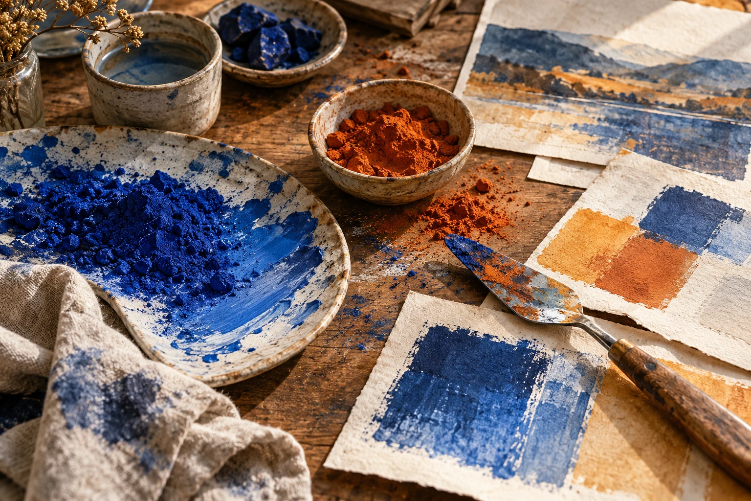
Tints, shades, and tones: make a useful color range
Build lighter, darker, and quieter versions of a base color, then choose a short range that stays distinguishable in real illustrations and design components.

Name the kind of change
In common art instruction, a tint is a color lightened with white, a shade is darkened with black, and a tone is modified with gray. These terms describe mixing relationships. Digital controls may offer different routes to similar appearances, so always inspect the resulting color rather than relying on a slider's name.
The practical goal is a range with usable differences. A dark blue heading, a medium blue diagram, and a pale blue field may belong together while doing separate jobs. Simply generating ten equally spaced numerical values does not guarantee ten equally useful visual steps, especially across different color models.
Choose endpoints first
Decide what your lightest and darkest versions need to accomplish. The lightest might separate a panel from white paper; the darkest might carry a large title. Put those endpoints into the layout early. If either fails its job, there is little benefit in polishing the intermediate swatches.
Add a middle color that clearly belongs to the same family without becoming indistinguishable from an endpoint. Compare all three at the size they will occupy. Tiny palette chips can exaggerate the appeal of a very pale color that becomes barely perceptible when used for a thin line or small mark.
Watch hue drift
Physical mixtures and digital lightening methods can shift how a color appears. A blue that looks balanced at full strength may become unexpectedly violet in a pale mixture, or a yellow may seem dirty when darkened. Judge the entire range together rather than approving each swatch independently.
If the range drifts away from your intended family, adjust the intermediate hues deliberately. There is no requirement that a useful design palette follow a perfectly straight mathematical path. What matters is an intelligible progression and reliable combinations. Keep the original base color nearby so the adjustment remains purposeful.
Avoid unnecessary steps
Select only the differences your content needs. A map with three levels of emphasis may benefit from three clear versions, while a shaded illustration may need smoother transitions. Too many near-duplicates make it difficult for someone else to apply the palette consistently and invite accidental substitutions.
Label the final swatches by purpose as well as appearance. Deep ink, main blue, and pale panel communicate more than blue one, two, and three. Include a sample diagram or page with the palette. The sample shows where separation matters and where neighboring values are allowed to blend softly.
Try it yourself
- Choose usable light and dark endpoints in the final layout.
- Add the minimum number of visibly distinct middle steps.
- Name each swatch by the role it performs.
Worked example: a three-level exhibition map
Create a fictional gallery map with dark blue outlines, medium blue highlighted rooms, and pale blue circulation areas. Start with just those three levels and white paper. If highlighted rooms blend into circulation areas, darken the room fill or lighten the circulation fill; do not add an arbitrary fourth blue. Place a medium blue room next to both white and pale blue before approving it, because the surrounding field changes how strongly that same fill appears.
References & further reading
Examples and exercises in this guide are original teaching scenarios.