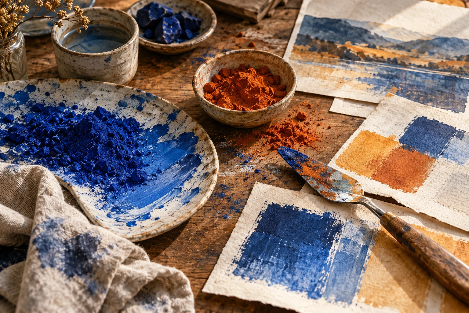
Warm and cool colors: create depth and emphasis
Understand color temperature as a relationship, compare warm and cool versions of a hue, and use those shifts deliberately in illustrations and layouts.
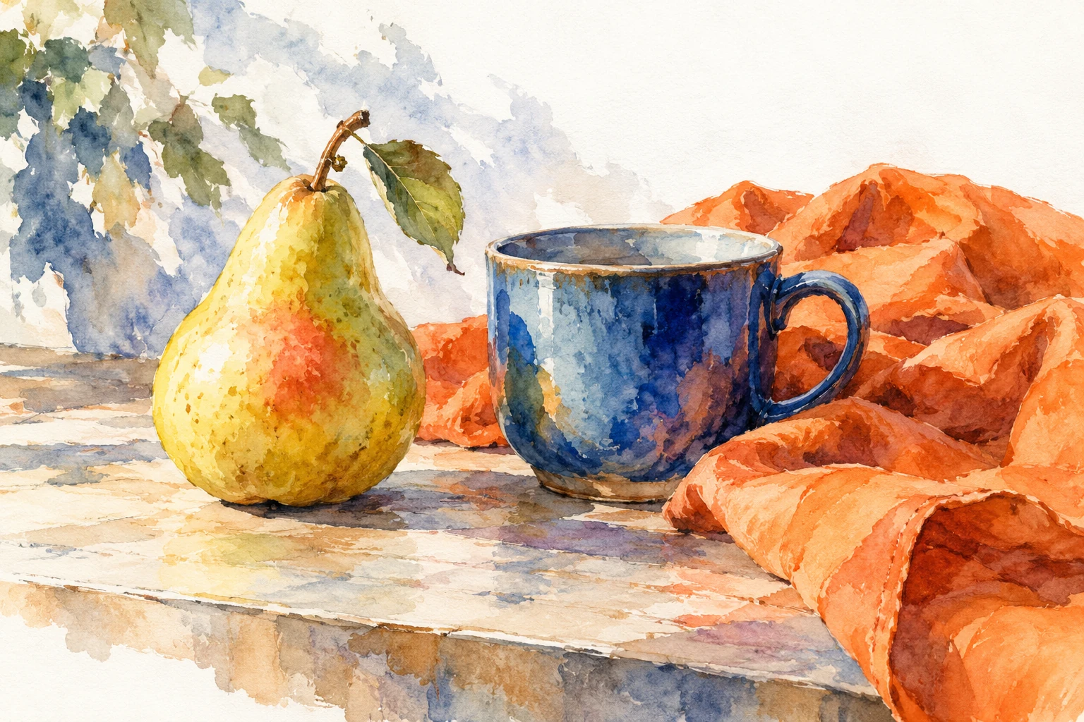
Compare colors in context
Warm and cool are useful relational descriptions, not precise temperature measurements. Orange may feel warm beside blue, while a yellowish green may feel warmer than a bluish green. Looking at neighboring swatches matters more than assigning every tube or digital value a permanent label.
Make pairs within a single family. Compare a red leaning toward orange with one leaning toward violet, or a blue leaning toward green with one leaning toward violet. These small shifts are often more useful than dividing the entire palette into two opposing camps. They let you adjust mood without changing the subject's basic identity.
Use temperature alongside value
A warm foreground and cool distance can suggest separation, but temperature does not replace lightness, scale, overlap, or edge control. If the foreground and background have confused silhouettes, a warmer wash may simply produce a warmer confusion. Establish the large spatial relationships first.
Then experiment with temperature in one plane at a time. Keep the distance subdued while making a nearby object slightly warmer, or reverse that arrangement for a different effect. Treat the result as a choice to evaluate rather than a law that every landscape must follow. Lighting and local color can support many convincing arrangements.
Keep the neutral areas alive
A gray mixed or selected with a warm bias can sit differently from a cool gray. Put both beside your main hue before choosing. One may connect the image to a paper background, while the other makes it seem more detached. Neither is automatically more sophisticated or correct.
Avoid adding warmth to every surface simply to make a scene welcoming. If all areas move in the same direction, the intended warm focal area may lose its distinction. Let some shadows or background surfaces stay quieter and cooler so the chosen warm note has a visible relationship to work against.
Diagnose unwanted color casts
If a composition feels unexpectedly yellow, check the background and largest neutral shapes before editing the tiny accent. Large areas strongly influence the overall impression. A small cool swatch may look dramatic in the palette but contribute little once surrounded by an expansive warm field.
Compare two versions with identical values and shapes. Change only the background's temperature bias. This isolates the cause of the mood shift and helps you explain it. Save the comparison when you approve the final choice, especially if another person will reproduce the palette in a different medium.
Try it yourself
- Create warm and cool variants within one hue family.
- Keep shape and value fixed during the first comparison.
- Adjust the largest color field before refining small accents.
Exercise: the same window at two times
Draw a square window, a table, and a cup in a simple room. Keep the shapes and light-dark pattern identical across two copies. In one, use a warm pale wall and cooler blue-gray shadows. In the other, use a cool pale wall and warmer muted shadows. Avoid adding a painted sun or moon: let the relationships do the work. Compare which cup feels more prominent and whether the wall or the shadow now carries the strongest color impression.
References & further reading
Examples and exercises in this guide are original teaching scenarios.