Color theory for beginners: make colors work together
Learn to separate hue, lightness, and intensity, then turn a small set of colors into a readable composition with a clear focal point.
Separate the decisions
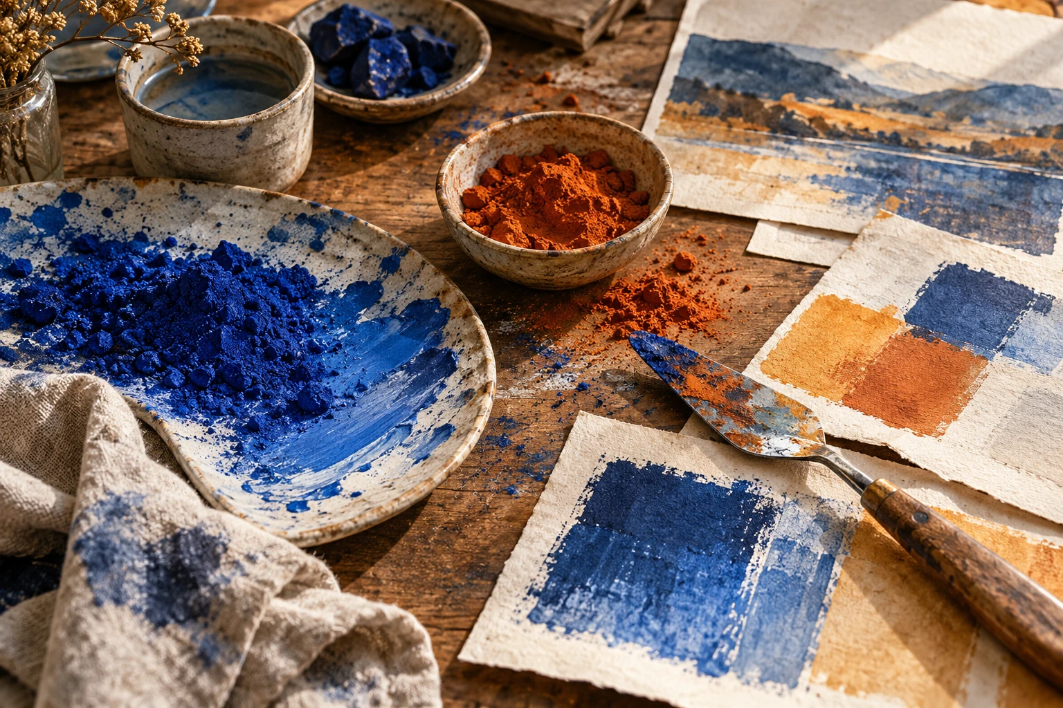
A useful first palette begins with three different decisions: what kind of color you want, how light or dark it should appear, and how forceful it should feel. Choosing a blue does not settle the other two. A pale smoky blue and a deep electric blue create very different relationships with the same orange.
Keep those decisions visible in your sketchbook. Label swatches with ordinary descriptions such as dark quiet blue or light lively yellow. This language makes revisions easier: you can ask for a lighter background without accidentally asking for a brighter, more saturated one. Color vocabulary should help you change the work, rather than become a memorization exercise.
Give colors unequal jobs
Choose a background, a working color for most shapes or text, and a small accent. Unequal areas make the palette easier to organize. If every hue occupies an equally large block and carries the same intensity, the viewer receives several competing invitations with little reason to favor one.
Area also changes what you can tolerate. A vivid coral may feel comfortable on a tiny label but overwhelming across a whole page. Judge a color in its intended quantity before rejecting it. Move the same swatch from a corner to the background and observe how the rest of the composition seems to change.
Check structure before harmony
Reduce your sketch to three gray values. Can you still distinguish the main object from its surroundings? If two important shapes merge, a pleasing color relationship will not automatically separate them. Try changing one shape's lightness, its edge, or its position before adding a completely new hue.
Then restore the color and look for unnecessary competition. Two bright patches far apart can split attention even when their sizes differ. Quiet the less important patch or connect the pair through repetition. Harmony is a relationship among actual shapes, materials, and spaces; a row of isolated palette squares cannot show the whole result.
Revise one variable at a time
When a palette feels wrong, make three copies. Change only lightness in the first, intensity in the second, and hue in the third. This small comparison identifies the decision that matters. Changing all three at once can produce an attractive accident without teaching you how to repeat it.
Keep a record of rejected options with a short reason. Background competes with title is more useful than ugly green. On your next project, that note becomes a practical warning about hierarchy. You are building a personal decision process, not a universal list of good and bad combinations.
Try it yourself
- Make three labeled color swatches before drawing the layout.
- Assign each swatch a specific job and approximate area.
- Compare the finished card in color and in grayscale.
Exercise: a library workshop card
Design a card for a fictional neighborhood drawing workshop. Use a warm off-white background, dark blue lettering, and a small orange pencil shape. Make a second version with orange covering half the card. Compare where you look first. In a third version, keep the orange small but lighten the blue title until it loses authority. Restore enough darkness for the title to lead. The exercise shows how proportion and lightness can matter more than selecting another set of hues.
References & further reading
Examples and exercises in this guide are original teaching scenarios.


