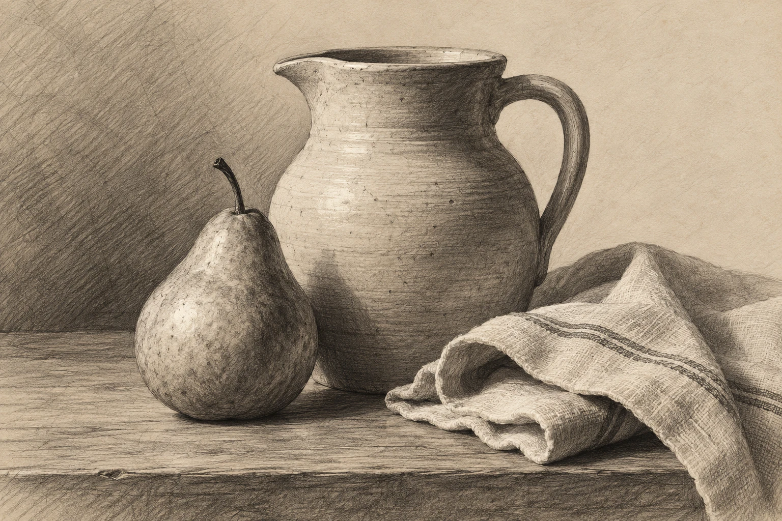
Pencil shading: build form with a small value range
Observe the large light and shadow groups, control pencil pressure and layers, and distinguish form shadows from cast shadows before blending fine transitions.

Set up clear light
Choose a simple matte object and one dominant light direction. A sphere-like fruit, a small box, or a plain cup is easier to study than a reflective patterned object. Keep the arrangement stable so changes in the drawing come from your decisions rather than a moving light or viewpoint.
Before shading, draw the large proportions lightly. Shading can make a mistaken shape look convincing at first, which makes it harder to revise later. Check the silhouette, main axes, and contact with the supporting surface. Then identify the broad light area and shadow area as separate groups.
Use a limited value plan
Make a small scale of a few pencil values on the same paper. Choose a light, a middle, and a dark that you can reproduce without damaging the surface. Use those groups to establish the object before attempting every subtle transition visible in the reference.
Preserve the paper for the lightest areas when appropriate. If the whole drawing becomes uniformly gray, the light has little room to stand out. Darken selectively and compare each new patch with the existing groups. A clear arrangement of a few values often explains form better than a smoothly blended but compressed range.
Control marks and edges
Build darker areas through controlled layers rather than pressing hard immediately. The exact behavior depends on the pencil and paper, so test both on a scrap. Keep your marks consistent enough that accidental streaks do not become more noticeable than the form you are describing.
Distinguish the object's turning shadow from the shadow it casts on another surface. Their edges may behave differently in the observed setup. A cast shadow can be sharper near contact and softer farther away, but inspect the real subject instead of applying the pattern mechanically. Edge changes should support the light situation.
Blend only for a reason
Blending can soften transitions, but it can also spread graphite into areas that should remain light and reduce the clarity of value groups. Establish the structure first. If you blend, use a controlled tool and compare the result with an unblended study to understand what you gain or lose.
Finish by stepping back and checking whether the object reads as a volume. If it looks flat, inspect the large shadow boundary, reflected light, and contact shadow before adding surface texture. Keep reflected light within the larger shadow relationship when that is what you observe, rather than turning every subtle reflection into another highlight.
Try it yourself
- Establish proportion and three broad value groups first.
- Build graphite in controlled layers on the actual paper.
- Check shadow types and edge behavior before adding texture.
Exercise: an egg-shaped stone
Place a smooth pale stone on a sheet of paper with a lamp to one side. Draw its outline, then map the broad shadow as one middle value and the contact area as a darker accent. Leave the main light area mostly paper. Add a small number of transitions without blending the whole surface. If the stone looks like a flat gray oval, compare the turning shadow with the cast shadow and check whether the darkest contact actually touches the stone.
References & further reading
- National Gallery of Art: Explore the Basics of Drawing ↗
- Harold Speed: The Practice and Science of Drawing (public-domain edition) ↗
Examples and exercises in this guide are original teaching scenarios.