Design website navigation around visitor tasks
Organize an arts publication with clear destinations, stable labels, local navigation, and preserved context, then test the structure through realistic finding tasks.

Name destinations readers can predict
Navigation should help a visitor decide where to go and understand where they are. An arts publication may mix tutorials, essays, resources, and archived material. Naming its sections after internal teams or poetic concepts can make that mixture harder to explore. Start with destinations readers can distinguish without learning the organization.
Separate global and local navigation
Separate global navigation from local navigation within a collection or article series. Use stable, descriptive labels and show the current location. Keep an archive available through a secondary destination if it serves a different reading task. A search control complements navigation but should not compensate for categories whose meaning remains unclear. Make the tradeoff visible on paper before choosing the most polished option. One version may expose more information while another saves space; neither advantage automatically resolves the task. Label the decision point, the evidence available there, and the cost of a mistaken choice. Prefer the arrangement that lets a person understand and correct that choice without reconstructing the entire journey from memory.
Map three publication finding tasks
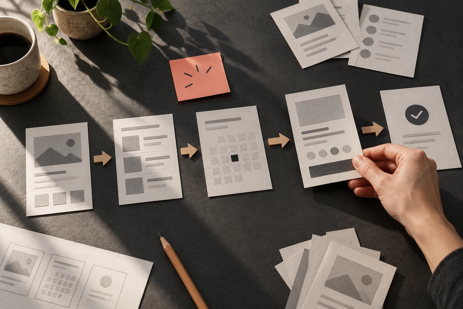
Make a small site map for a reader seeking an accessible exhibition checklist, another seeking a prototyping exercise, and a third following an old article link. Write the expected destination for each task. Sketch the category page and article page together so that the route back to related material stays visible. Give the artifact to a colleague with the task description but without the design rationale. Ask them to describe what they expect before making a choice. Compare that expectation with the result the prototype supplies. If they differ, locate the cue that created the expectation. Changing a label, grouping, or sequence may resolve the mismatch more effectively than adding a longer explanation after the action.
Repair unclear structure before adding cues
If a destination appears under several unrelated labels, decide whether cross-linking or a clearer category solves the issue. If every section must fit into one crowded bar, consider a simpler top level with local detail. Navigation that changes unpredictably between articles makes it harder to build a useful mental map. Reproduce the problem from its actual starting state instead of inspecting only the final screen. Trace which information disappeared, which expectation was set, and which action became unavailable. Fix the earliest misleading cue that you can identify. A patch at the end of the sequence may quiet one symptom while leaving the same confusion in every other route through the task.
Test labels without revealing the route
Ask someone unfamiliar with the site to predict what each label contains before opening it. Then give them a finding task without repeating the navigation wording. Record unclear predictions and dead ends as questions for revision. A coherent structure allows several reasonable routes while keeping destination names and current-location cues consistent. Include a direct article arrival as well as a homepage arrival; both visitors need an understandable route through the publication.
Worked decision
A direct visitor to an archived article needs a recognizable publication identity, an Archive destination, and relevant current reading routes.
References & further reading
Examples and exercises in this guide are original teaching scenarios.