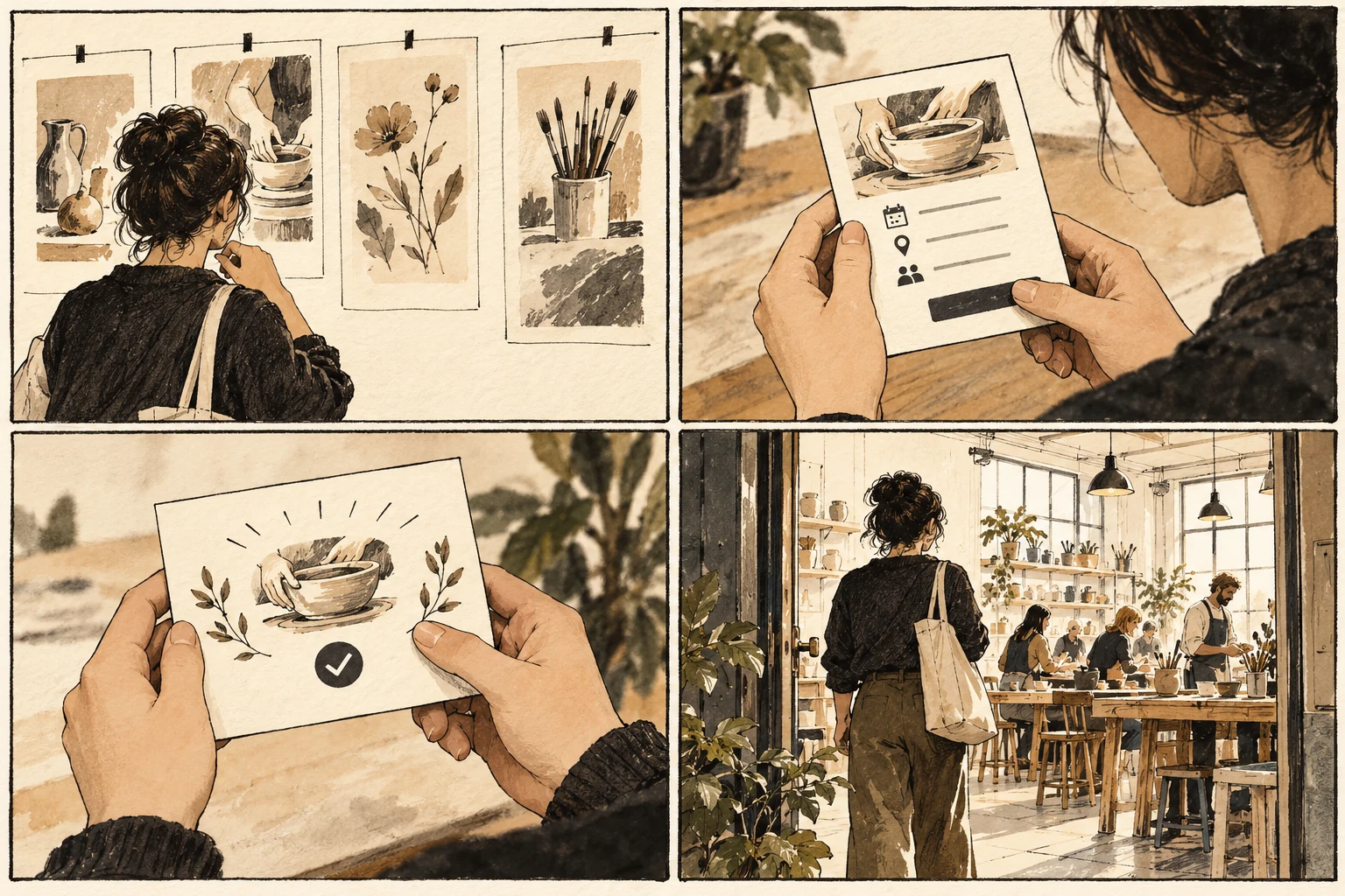
Interaction design examples: make a workshop booking understandable
A booking journey makes interaction design tangible: choices, system states, feedback, and recovery all become visible in a small, testable sequence.

A booking is a sequence of commitments
A workshop booking is an interaction, even when its screens look like ordinary forms. Someone chooses a session, decides whether the available place suits them, enters details, and needs reliable confirmation. Interaction design connects these moments. Start with the change the person wants in the world: a reserved place they can actually attend.
Keep choosing a session separate from committing to a booking. Show date, location, duration, materials, and price beside each option. A selected session is a provisional choice; a confirmed booking is a different state. Use different language for those states so that selecting a card does not imply a reservation already exists. Write the rule as a short contract between the person and the interface: an action has a visible consequence, that consequence has a recognizable state, and the next action remains possible. Sketch the ordinary path and one interruption beside it. This exposes missing information earlier than polishing a single screen. Keep the labels in the sketch close to the eventual product language so that unclear words cannot hide behind annotation.
Sketch the printmaking class
Sketch a Saturday printmaking class with two session times. Add a waiting-list version and a version where the last place becomes unavailable before submission. Write the exact message and available action for each state. Include a confirmation that identifies the chosen session and explains how to change or cancel it. Make a paper walkthrough with one card for each important state. Add a second set of cards for an interruption, a changed answer, and a return visit. Someone else should be able to operate the cards using only the visible instructions. Where they need hidden knowledge, note the missing information instead of teaching the intended path. Revise the cards before spending time on detailed visual treatment.
Recover when the last place disappears
If places disappear during checkout, preserve the contact information while asking for a different session. An unexplained return to the calendar makes the person wonder whether the first booking succeeded. If a confirmation email fails, the on-screen receipt should still communicate the booking status and a reference usable by the studio. Read every instruction while pretending the preceding explanation was missed. People arrive from links, resume after breaks, and move through content in different ways. Put the necessary context where the action happens. If the same problem recurs in several places, revise the underlying pattern instead of adding a separate warning to each instance. Shared causes usually deserve a coherent design response.
Check that completion is recognizable
Review the journey by asking a partner to point out when the place becomes reserved and how they know. If they cannot distinguish selection, processing, and confirmation, revise those transitions before changing the visual style. Keep the state sketches as part of the design handoff; they explain behavior a static hero screen cannot show.
Worked decision
A selected 10:00 session reads Review booking. Only a completed reservation reads Place confirmed and provides the session details and reference.
References & further reading
Examples and exercises in this guide are original teaching scenarios.