Form validation UX: help artists correct submissions
Plan validation timing, local error messages, an error summary, preserved answers, and system failures for an artwork submission form with realistic correction tasks.

Make correction part of submission
An artwork submission form should help someone provide usable information without making correction feel like starting over. Validation design includes when a problem appears, how it is described, and what remains available afterward. A red border alone cannot explain why a title, contact address, or image needs attention.
Validate actual service requirements
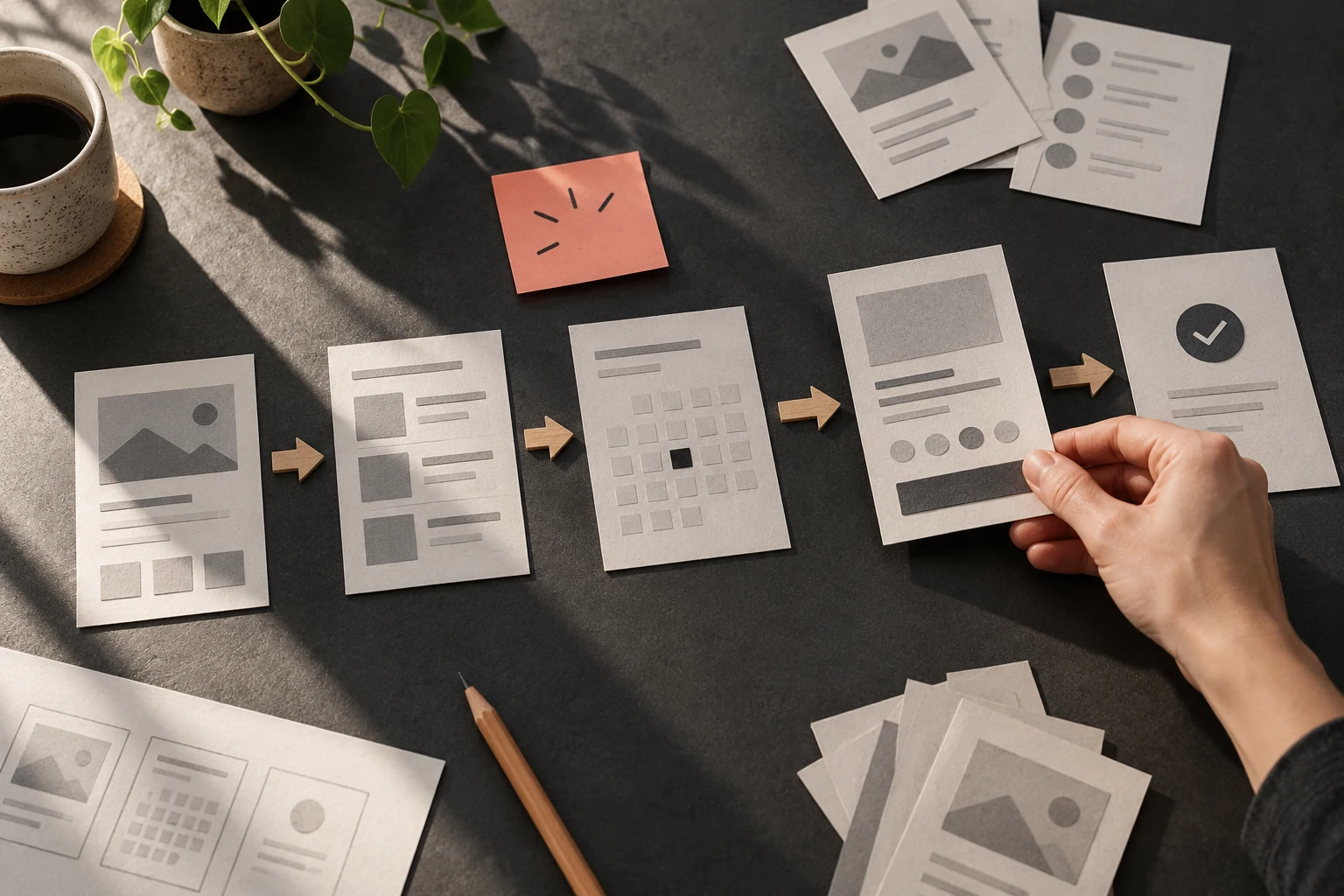
Validate only rules the service actually requires. Explain restrictive formats before entry, and avoid declaring a field wrong while someone is still typing a valid answer. For submission-time errors, pair field-level guidance with a summary that links to the affected answers. GOV.UK's error summary guidance offers an established implementation reference. Write the rule as a short contract between the person and the interface: an action has a visible consequence, that consequence has a recognizable state, and the next action remains possible. Sketch the ordinary path and one interruption beside it. This exposes missing information earlier than polishing a single screen. Keep the labels in the sketch close to the eventual product language so that unclear words cannot hide behind annotation.
Write three specific correction messages
Create a form with title, email, medium, dimensions, and an image. Enter a missing title, an incomplete email, and a file beyond the stated limit. Write a separate message for each issue. Preserve the accepted fields and show the person which image, if any, remains attached after correction. Make a paper walkthrough with one card for each important state. Add a second set of cards for an interruption, a changed answer, and a return visit. Someone else should be able to operate the cards using only the visible instructions. Where they need hidden knowledge, note the missing information instead of teaching the intended path. Revise the cards before spending time on detailed visual treatment.
Separate input errors from service failures
Separate input problems from service problems. An unavailable upload server is not evidence that the artist chose the wrong file. If a corrected value is rejected again, check that the displayed rule and actual validation agree. Do not erase a detailed artist statement because another field contains an error. Read every instruction while pretending the preceding explanation was missed. People arrive from links, resume after breaks, and move through content in different ways. Put the necessary context where the action happens. If the same problem recurs in several places, revise the underlying pattern instead of adding a separate warning to each instance. Shared causes usually deserve a coherent design response.
Operate the complete correction route
Test the correction sequence rather than reviewing error screenshots in isolation. A person should find the problem, understand the required change, reach the field, and submit again without losing accepted work. Keep the messages specific and courteous. Record technical uncertainties, such as file retention after failure, before promising behavior in interface copy. Include a valid submission in the same walkthrough to confirm that helpful error handling does not obstruct ordinary completion.
Worked decision
If the title is blank and the image is accepted, explain the missing title and preserve the image rather than resetting the submission.
References & further reading
Examples and exercises in this guide are original teaching scenarios.