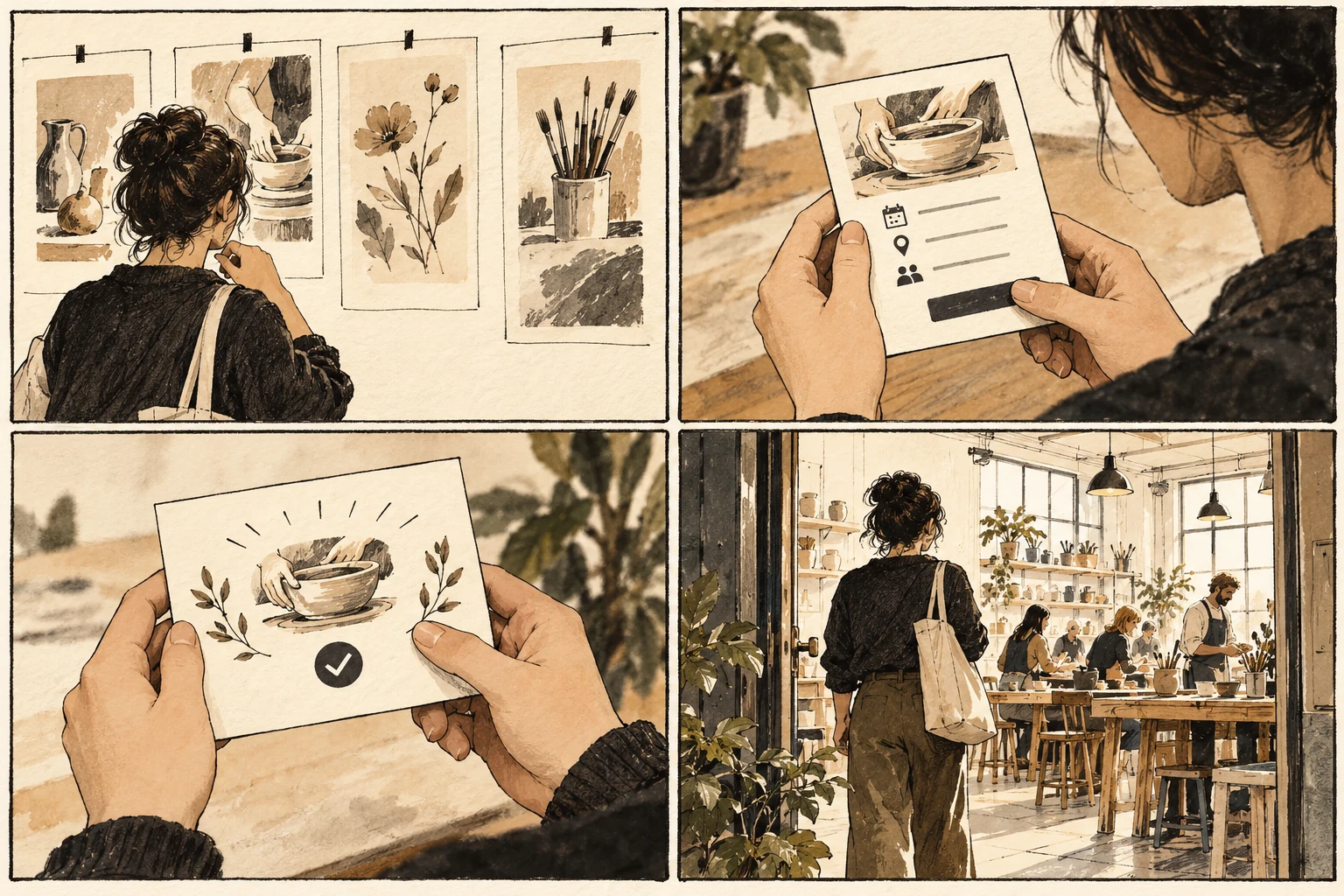
Empty state design for a new creative collection
Distinguish a new collection, a filtered collection, and a loading failure, then write useful next actions that match each state without inventing content.

An empty view has several possible causes
An empty collection can mean several different things. A new member may not have saved any references; an experienced member may have applied restrictive filters; the service may have failed to load existing work. Those situations require different explanations. Treating them all as Nothing here leaves the person to diagnose the product.
Name the cause that the system can actually determine. A new collection can invite the first save and explain where saved references will appear. Filtered results should retain the active filters and offer clear ways to broaden them. A loading failure needs a retry route and an honest account of what is currently unknown. Place the proposed solution beside a simpler alternative and ask what extra work each one creates. Count decisions the person must make, rather than decorative elements on the canvas. A useful control explains its scope before activation and its result afterward. If the design depends on someone remembering an instruction from a previous screen, move that instruction closer to the decision or remove the dependency.
Sketch three fabric-collection states
Design three empty screens for a fabric inspiration collection. In the first, no items exist. In the second, saved items exist but none match blue and wool. In the third, items cannot load. Give each screen a distinct heading, explanation, and primary action. Keep optional discovery content separate from the status. Keep a record of the starting conditions alongside the prototype. The same action can be easy with a familiar record and confusing with an incomplete one. Choose the record deliberately, then describe what would count as completion. Show the state immediately after the action as carefully as the initial view. A prototype that ends at the click cannot answer whether the person understands the result.
Keep cheerful feedback truthful
A cheerful illustration can obscure a failure when the system has not confirmed that the collection is empty. Equally, a retry button is useless when the person simply has no saved items. If a removal action creates the empty state, explain the resulting state without suggesting that the previous collection never existed. Check whether a local fix creates a problem elsewhere. A longer label may clarify one choice but become clipped in another view; an extra confirmation may protect a destructive action but obstruct routine work. Carry the revision through the full example and its alternate route. Document the tradeoff explicitly so the next person modifying the design understands which behavior the change was intended to protect.
Trace the collection's changing states
Review the state transitions with a colleague: create a collection, save an item, filter it out, clear the filter, remove it, and simulate a loading problem. The interface should remain truthful throughout. Judge the design by whether someone understands the cause and can take a relevant next step, not by how entertaining the blank area looks.
Worked decision
No saved items invites a first save. No blue wool matches offers filter removal. Cannot load collection offers a retry without claiming emptiness.
References & further reading
Examples and exercises in this guide are original teaching scenarios.