Confirmation pages that close the loop
Design a workshop confirmation around status, a usable reference, attendance details, next steps, corrections, and uncertain outcomes instead of a decorative success message alone.
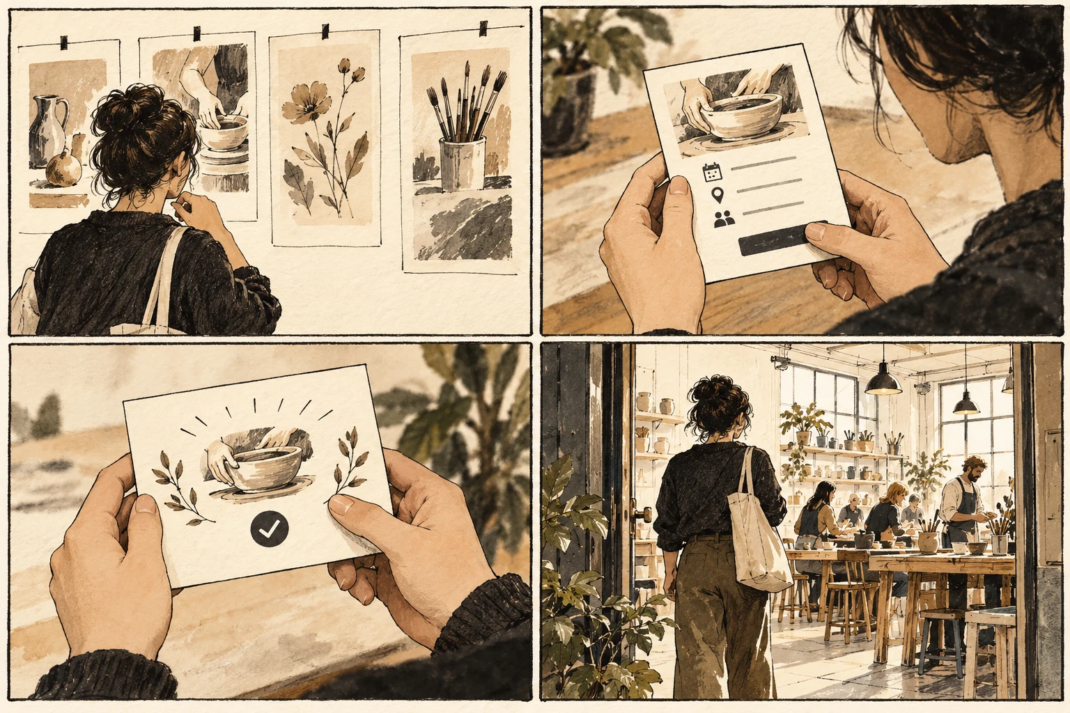
Make confirmation a usable receipt
A confirmation page is a receipt for a meaningful action. After booking a workshop, someone needs to know whether the place is reserved, which session they chose, and what happens next. A large checkmark can support that message, but it cannot replace the information required to act on the booking.
Put status before promotion
Put the confirmed outcome first, followed by the session details, reference, and useful next steps. Distinguish the on-screen status from email delivery. Provide a clear route for changing or canceling the booking if those actions are supported. Avoid making another purchase or newsletter subscription visually compete with the receipt. Place the proposed solution beside a simpler alternative and ask what extra work each one creates. Count decisions the person must make, rather than decorative elements on the canvas. A useful control explains its scope before activation and its result afterward. If the design depends on someone remembering an instruction from a previous screen, move that instruction closer to the decision or remove the dependency.
Confirm a bookbinding workshop accurately
Draft a confirmation for a two-hour bookbinding workshop. Include venue, arrival instruction, materials responsibility, and a reference. Add a version where the booking is accepted but payment remains pending, and another where the system cannot confirm the outcome. The heading should accurately distinguish those states. Keep a record of the starting conditions alongside the prototype. The same action can be easy with a familiar record and confusing with an incomplete one. Choose the record deliberately, then describe what would count as completion. Show the state immediately after the action as carefully as the initial view. A prototype that ends at the click cannot answer whether the person understands the result.
Resolve uncertain outcomes before retry
A retry link can create duplicate bookings when the first request succeeded but its response was lost. Resolve uncertain status before encouraging another submission. If the page is reachable only once, the person may lose their reference. Consider a retrievable receipt or another reliable way to access the booking information. Check whether a local fix creates a problem elsewhere. A longer label may clarify one choice but become clipped in another view; an extra confirmation may protect a destructive action but obstruct routine work. Carry the revision through the full example and its alternate route. Document the tradeoff explicitly so the next person modifying the design understands which behavior the change was intended to protect.
Read the receipt without the form
Review the page with someone who has not seen the preceding form. They should identify the outcome, attendance details, and next action from the page alone. Check print and narrow-screen presentation for the essential facts. A useful confirmation remains understandable after the excitement of completion has passed and someone returns simply to find their booking. Keep promotional messages below the receipt details so the primary outcome remains easy to retrieve on a later visit.
Worked decision
Booking accepted, payment pending describes a different outcome from Booking confirmed. Give each its actual next step and usable reference.
References & further reading
Examples and exercises in this guide are original teaching scenarios.