Typography poster design: let the words create the image
Build an expressive poster from the actual wording, control line breaks and negative space, and preserve essential information while exploring scale and arrangement.
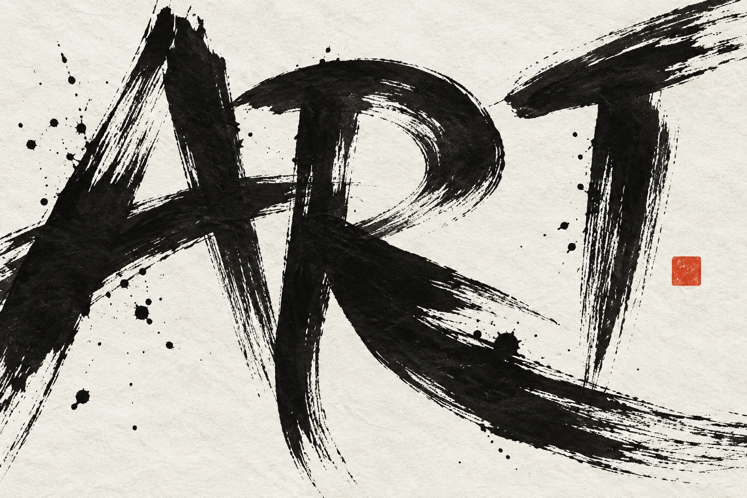
Find the verbal center
Choose the phrase or title that carries the poster's idea. Read it aloud and identify meaningful word groups. A typographic composition should work with that language structure instead of breaking the phrase into attractive but confusing fragments. The words are content and visual material at the same time.
List the supporting details separately. A poster can be expressive in its title while treating the date, venue, and next step calmly. Keeping those roles distinct creates room for experimentation without making the entire page difficult to read. Use the actual information before committing to the arrangement.
Explore scale and line arrangement
Make small sketches using simple blocks for the words. Try a large single word, a stacked phrase, and a composition with one strong size change. Look at the resulting open shapes and the relationship to the page edges. You can discover the broad structure before choosing an elaborate display face.
Keep line breaks meaningful where possible. A short connecting word isolated on its own line may look deliberate or accidental depending on the phrase. Compare alternatives rather than accepting the first fit. Change width and scale before resorting to extreme compression or spacing that makes individual words hard to recognize.
Use letterforms as structure
Repeating stems, curves, or diagonals can create visual connections across the composition. Align visible shapes carefully, remembering that optical edges do not always match the text box. A rounded letter or punctuation mark may need a different apparent placement from a straight stem to feel aligned.
If letters overlap, rotate, or crop, inspect recognition at the intended distance. A partially hidden letter can work when the word remains unmistakable, but several simultaneous distortions may turn the title into a puzzle. Decide how much interpretation suits the audience and preserve a clear route to the essential message.
Finish with restraint
Add color or texture only after the black-and-white structure works. If the poster lacks impact, revise scale, density, and space first. A complicated background can obscure the very letter relationships that made the concept interesting. Keep secondary information stable and give it enough contrast for ordinary reading.
Proof the title for spelling and word order, then inspect pair spacing, punctuation, and export behavior. Print a small version and view it from a distance. A successful typographic poster can reward close inspection while still communicating its central phrase in the first encounter.
Try it yourself
- Sketch the actual words as large compositional shapes.
- Compare meaningful line breaks and controlled scale changes.
- Preserve a clear supporting information block and test from a distance.
Exercise: the title Make Room
Create three fictional posters for an open studio titled Make Room. In one, stack the words with generous space around them. In another, enlarge Room until its letterforms define most of the page. In the third, create a narrow gap between the words that becomes the central visual event. Keep the same small date and venue block in each. Compare which version expresses openness without making the phrase hard to recognize, then refine only the strongest concept.
References & further reading
Examples and exercises in this guide are original teaching scenarios.